Weather Forecasting with Scilab
Introduction
The weather is probably one of the most discussed topic all around the world. People are always interested in weather forecasts, and our life is strongly influenced by the weather conditions. Let us just think of the farmer and his harvest or to the happy family who wants to spend a week-end on the beach, and we understand that there could be thousands of good reasons to be interested in knowing the weather conditions in advance.
This probably explains why, normally, the weather forecasts is the most awaited moment by the public of a television news.
Sun, wind, rain, temperature… the weather seems to be unpredictable, especially when we consider extreme events. Man has always tried to develop techniques to master this topic, but practically only after the Second World War, the scientific approach together with the advent of the media have allowed a large diffusion of reliable weather forecasts.
To succeed in forecasting it is mandatory to have a collection of measures of the most important physical indicators which can be used to define the weather in some relevant points of a region, at different times. Then, we certainly need a reliable mathematical model which is able to predict the values of the weather indicators in points and times where no direct measures are available.
Nowadays, very sophisticated models are used to forecast the weather conditions, based on registered measures, such as the temperature, the atmospheric pressure, the air humidity as so forth.
It is quite obvious that the largest the dataset of the measures the better the prediction: this is the reason why the institutions involved in monitoring and forecasting the weather usually have a large number of stations spread on the terrain, opportunely positioned to capture relevant information.
This is the case of Meteo Trentino (see [3]), which manages a network of measurement stations in Trentino region and provides daily weather forecasts.
Among the large amount of interesting information we can find in their website, there are also the temperature maps, such the one reported in Figure 1, where the predicted temperature at the terrain level for the Trentino is reported for a chosen instant. These maps are based on a set of measures available from the stations: an algorithm is able to predict the temperature field in all the point within the region and, therefore, to plot a temperature map.
We do not know the algorithm that Meteo Trentino uses to build these maps but we would like to set up our own procedure able to obtain similar results. To this aim we decided to use Scilab (see [1]) as a platform to develop such predictive model and gmsh (see [2]) as a tool to display the results.
Probably one of the most popular algorithm in the geo-sciences domain used to interpolate data is Kriging (see [5]). This algorithm has the notable advantage to exactly interpolate known data; it is also able to potentially capture non-linear responses and, finally, to provide an estimation of the prediction error. This last valuable feature could be used, for example, to choose in an optimal way the position of new measurement stations on the terrain.
Scilab has an external toolbox available through ATOMS, named DACE (which stands for Design and Analysis of Computer Experiments), which implements the Kriging algorithm. This obviously allows us to faster implement our procedure because we can use the toolbox as a sort of black-box, avoiding in this way to spend time implementing a non-trivial algorithm.
The weather data
We decided to download from [3] all the available temperatures reported by the measurement stations. As a result we have 102 formatted text files (an example is given in Figure 2) containing the maximum, the minimum and the mean temperature with a step of an hour. In our work we only consider the “good” values of the mean temperature: there is actually an additional column which contains the quality of the reported measure which could be “good”, “uncertain”, “not validated” and “missing”.
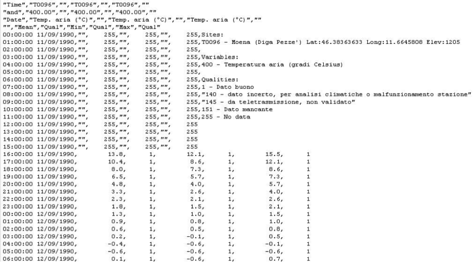
Figure 2 : The hourly temperature measures for the Moena station: the mean, the minimum and the maximum values are reported together with the quality of the measure.
The terrain data
Another important information we need is certainly the “orography” of the region under exam. In other words we need to have a set of triplets giving the latitude, the longitude and the elevation of the terrain. This last information is mandatory to build a temperature map at the terrain level.
To this aim we downloaded the DTM (Digital Terrain Model) files available in [4] which, summed all together, contain a very fine grid of points (with a 40 meters step both in latitude and longitude) of the
Trentino province. These files are formatted according to the ESRI standard and they refers to the Gauss Boaga Roma 40 system.
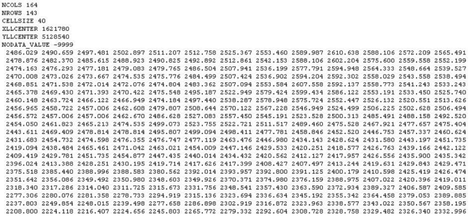
Figure 3 : An example of the DTM file formatted to the ESRI standard. The matrix contains the elevation of a grid of points whose position is given with reference to the Gauss Boaga Roma 40 system.
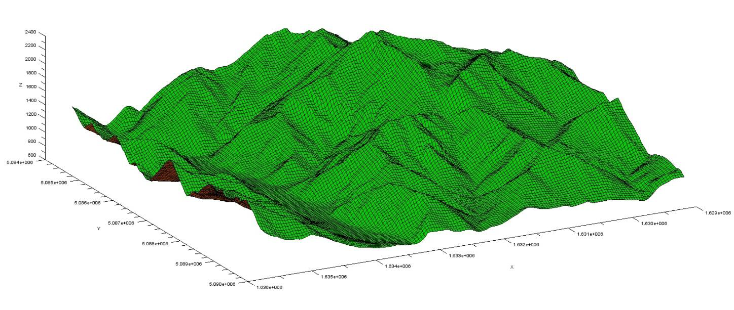
Figure 4 : The information contained into one DTM file is graphically rendered. As a results we obtain a plot of the terrain.
Set up the procedure and the DACE toolbox
We decided to translate all the terrain information to the UTM WGS84 system in order to have a unique reference for our data. This operation can be done just once and the results stored in a new dataset to speed up the following computations.
Then we have to extract, from the temperature files, the available data for a given instant, chosen by the user, and store them. With these data we should be able to build a Kriging model, thanks to the DACE toolbox. Once the model is available, we can ask for the temperature in all the points belonging to the terrain grid defined in the DTM files and plot the obtained results.
One interesting feature of the Kriging algorithm is that it is able to provide an expert derivation from the prediction. This means that we can have an idea of the degree to which our prediction is reliable and eventually estimate a possible range of variation: this is quite interesting when forecasting an environmental temperature.
Some results
We chose two different days of 2010 (the 6th of May, 17:00 and the 20th of January, 08:00) and ran our procedure to build the temperature maps.
In Figure 6 the measured temperatures at the 6th of May are plotted versus the height on the sea level of the stations. It can be seen that a linear model can be considered as a good model to fit the data. We could conclude that the temperature decreases linearly with the height of around 0.756 [°C] every 100 [m]. For this reason one could be tempted to use such model to predict the temperature at the terrain level: the result of this prediction, which is reported in Figure 5, is as accurate as the linear model is appropriate to capture the relation between the temperature and the height. If we compare the results obtained with these two approaches some differences appear, especially down in the valleys: the Kriging model seems to give more detailed results.
If we consider January the 20th, the temperature can no longer be computed as a function of only the terrain height. It immediately appears, looking at Figure 9, that there are large deviations from a pure linear correlation between the temperature and the height. The Kriging model, whose result is drawn in Figure 8, is able to capture also local positive or negative peaks in the temperature field, which cannot be predicted otherwise. In this case, however, it can be seen that the estimated error (Figure 10) is larger than the one obtained for 17th of May (Figure 7): this let us imagine that the temperature is in this case much more difficult to capture correctly.
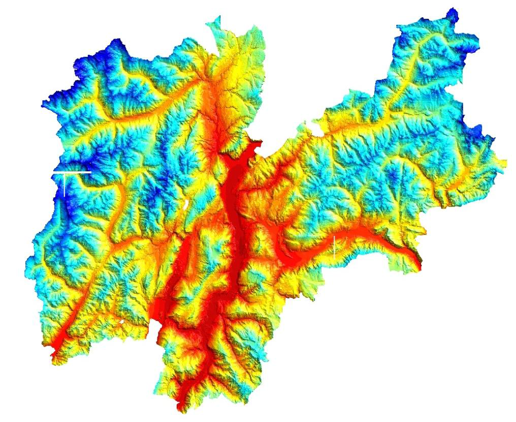
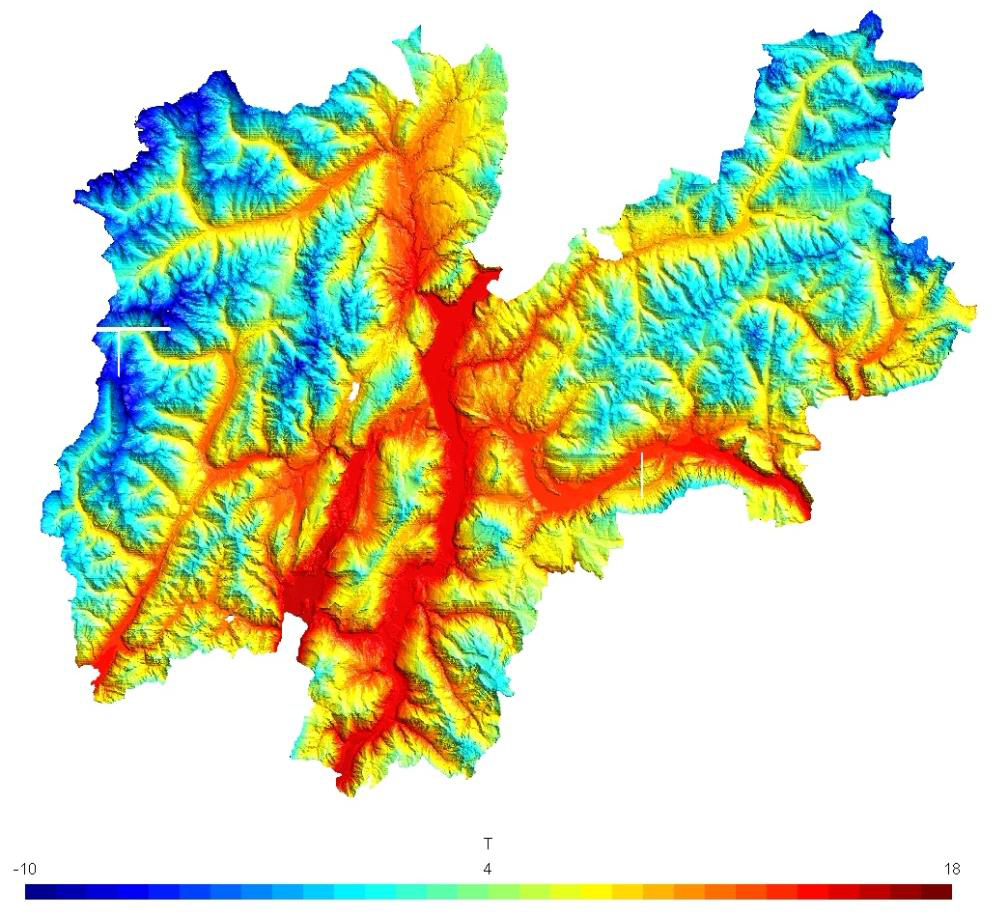
Figure 5 : 6th May 2010 at 17:00. Top: the predicted temperature at the terrain level using Kriging is plotted. The temperature follows very closely the height on the sea level. Bottom: the temperature map predicted using a linear model relating the temperature to the height. At a first glance these plots could appear exactly equal: this is not exact, actually slight differences are present especially in the valleys.
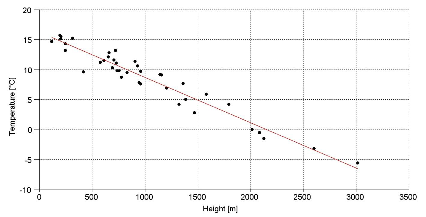
Figure 6 : 6th May 2010 at 17:00. The measured temperatures are plotted versus the height on the sea level. The linear regression line, plotted in red, seems to be a good approximation: the temperature decreases 0.756 [°C] every 100 [m] of height.
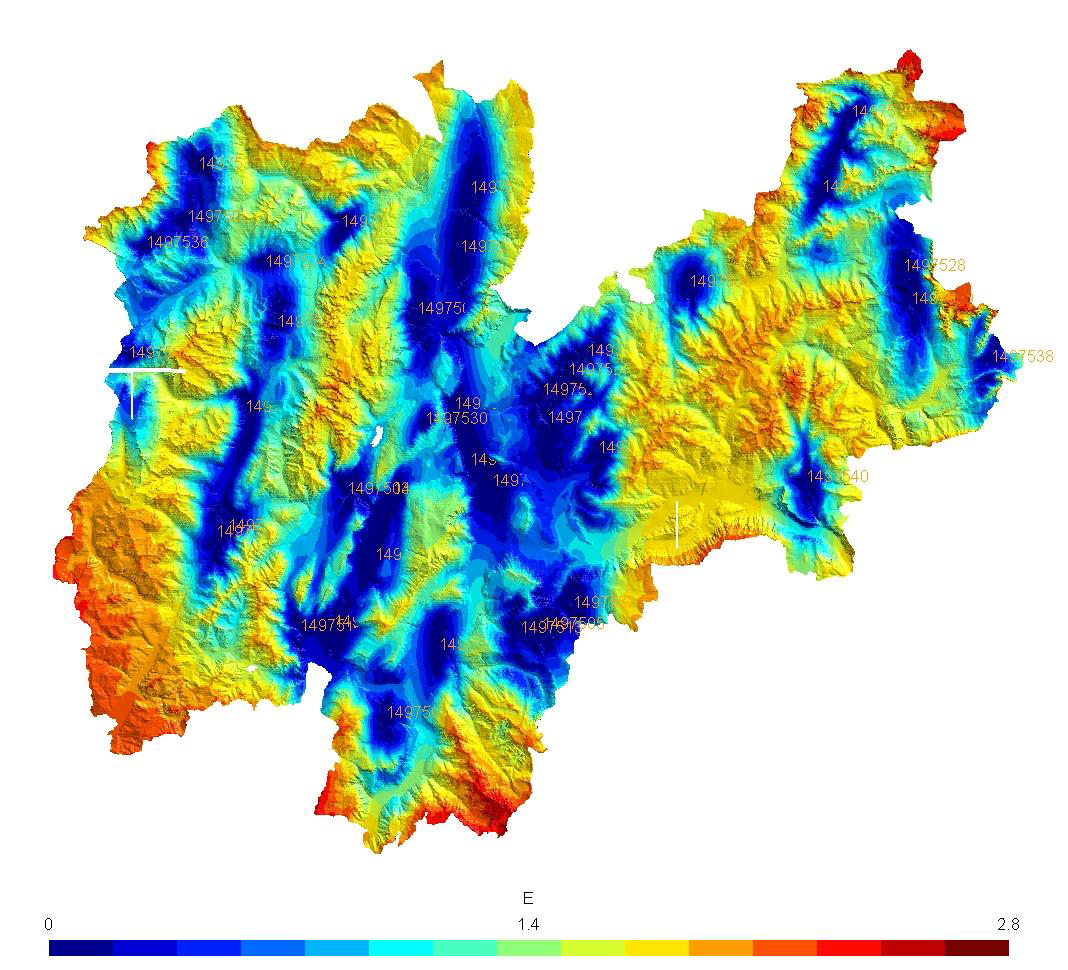
Figure 7 : 6th May 2010 at 17:00. The estimated error in predicting the temperature field with Kriging is plotted. The measurement stations are reported on the map with a code number: it can be seen that the smallest errors are registered close to the 39 stations while, as expected, the highest estimated errors are typical of zones where no measure is available.